
Calc Guide
Chapter
3
Creating Charts and Graphs
Presenting information visually
This document is Copyright © 2005–2011 by its contributors as listed below. You may distribute it and/or modify it under the terms of either the GNU General Public License (http://www.gnu.org/licenses/gpl.html), version 3 or later, or the Creative Commons Attribution License (http://creativecommons.org/licenses/by/3.0/), version 3.0 or later.
All trademarks within this guide belong to their legitimate owners.
Contributors
Barbara Duprey
Hal Parker
Feedback
Please direct any comments or suggestions about this document to: documentation@libreoffice.org
Acknowledgments
This chapter is based on Chapter 3 of the OpenOffice.org 3.3 Calc Guide. The contributors to that chapter are:
Richard
Barnes John Kane Peter Kupfer
Shelagh Manton Alexandre
Martins Anthony Petrillo
Sowbhagya Sundaresan Jean Hollis
Weber Linda Worthington
Ingrid Halama
Publication date and software version
Published 29 April 2011. Based on LibreOffice 3.3.
Some keystrokes and menu items are different on a Mac from those used in Windows and Linux. The table below gives some common substitutions for the instructions in this chapter. For a more detailed list, see the application Help.
|
Windows/Linux |
Mac equivalent |
Effect |
|
Tools → Options menu selection |
LibreOffice → Preferences |
Access setup options |
|
Right-click |
Control+click |
Open context menu |
|
Ctrl (Control) |
z (Command) |
Used with other keys |
|
F5 |
Shift+z+F5 |
Open the Navigator |
|
F11 |
z+T |
Open Styles & Formatting window |
Contents
Changing data ranges and axes labels 7
Adding or changing titles, legend, and grids 8
Adding or removing chart elements 9
Changing the chart area background 16
Changing the chart graphic background 16
Rotating 3D charts interactively 19
Formatting the chart elements 19
Formatting axes and inserting grids 19
Choosing and formatting symbols 21
Adding drawing objects to charts 22
Resizing and moving the chart 22
Charts and graphs can be powerful ways to convey information to the reader. OpenOffice.org Calc offers a variety of different chart and graph formats for your data.
Using Calc, you can customize charts and graphs to a considerable extent. Many of these options enable you to present your information in the best and clearest manner.
For readers who are interested in effective ways to present information graphically, two excellent introductions to the topic are William S. Cleveland’s The elements of graphing data, 2nd edition, Hobart Press (1994) and Edward R. Tufte’s The Visual Display of Quantitative Information, 2nd edition, Graphics Press (2001).
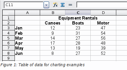
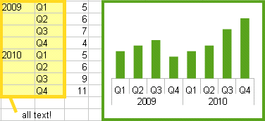
To demonstrate the process of making charts and graphs in Calc, we will use the small table of data in Figure 1.
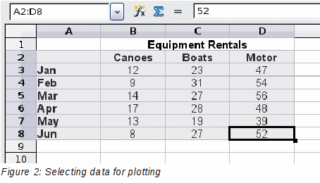
To create a chart, first highlight (select) the data to be included in the chart. The selection does not need to be in a single block, as shown in Figure 2; you can also choose individual cells or groups of cells (columns or rows). See Chapter 1, Introducing Calc, for more about selecting cells and ranges of cells.
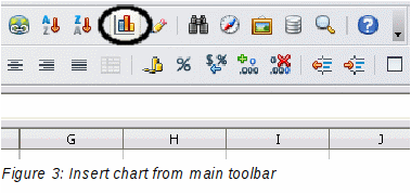
Next, open the Chart Wizard dialog using one of two methods.
Choose Insert → Chart from the menu bar.
Or, click the Chart icon on the main toolbar.
Either method inserts a sample chart on the worksheet, opens the Formatting toolbar, and opens the Chart Wizard, as shown in Figure 4.
|
Tip |
Before choosing the Chart Wizard, place the cursor anywhere in the area of the data. The Chart Wizard will then do a fairly good job of guessing the range of the data. Just be careful that you have not included the title of your chart. |
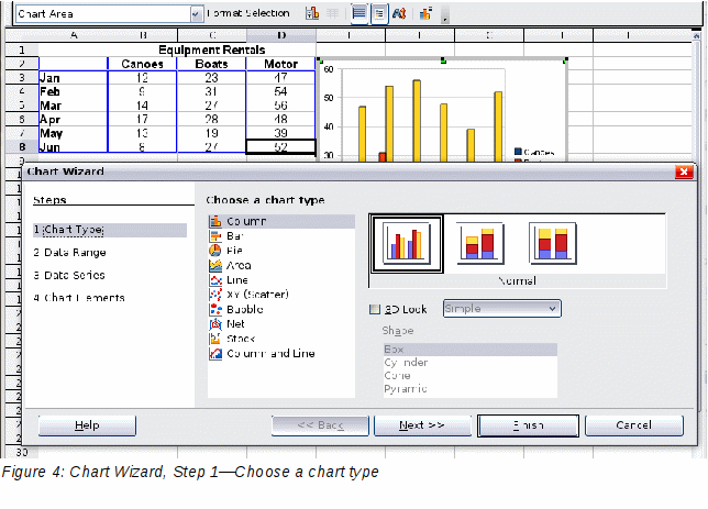
The Chart Wizard includes a sample chart with your data. This sample chart updates to reflect the changes you make in the Chart Wizard.
The Chart Wizard has three main parts: a list of steps involved in setting up the chart, a list of chart types, and the options for each chart type. At any time you can go back to a previous step and change selections.
Calc offers a choice of 10 basic chart types, with a few options for each type of chart. The options vary according to the type of chart you pick.
The first tier of choice is for two-dimensional (2D) charts. Only those types which are suitable for 3D (Column, Bar, Pie, and Area) give you an option to select a 3D look.
On the Choose a chart type page (Figure 4), select a type by clicking on its icon. The preview updates every time you select a different type of chart, and provides a good idea of what the finished chart will look like.
The current selection is highlighted (shown with a surrounding box) on the Choose a chart type page. The chart’s name is shown just below the icons. For the moment, we will stick to the Column chart and click on Next again.
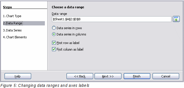
Changing data ranges and axes labels
In Step 2, Data Range, you can manually correct any mistakes you have made in selecting the data.
On this page you can also change the way you are plotting the data by using the rows—rather than the columns—as data series. This is useful if you use a style of chart such as Donut or Pie to display your data.
Lastly, you can choose whether to use the first row or first column, or both, as labels on the axes of the chart.
You can confirm what you have done so far by clicking the Finish button, or click Next to change some more details of the chart.
We will click Next to see what we can do to our chart using the other pages of the Wizard.
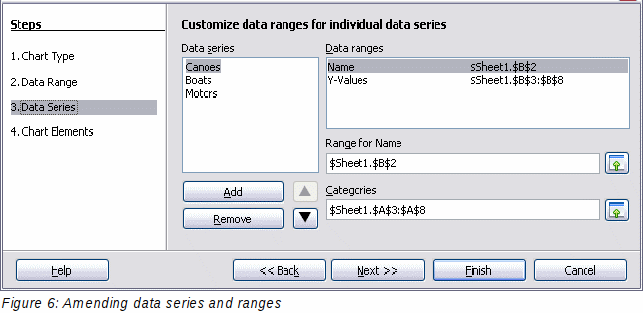
On the Data Series page, you can fine tune the data that you want to include in the chart. Perhaps you have decided that you do not want to include the data for canoes. If so, highlight Canoes in the Data series box and click on Remove. Each named data series has its ranges and its individual Y-values listed. This is useful if you have very specific requirements for data in your chart, as you can include or leave out these ranges.
|
Tip |
You can click the Shrink
button
|
Another way to plot any unconnected columns of data is to select the first data series and then select the next series while holding down the Ctrl key. Or you can type the columns in the text boxes. The columns must be separated by semi-colons. Thus, to plot B3:B11 against G3:G11, type the selection range as B3:B11;G3:G11.
The two data series you are selecting must be in separate columns or rows. Otherwise Calc will assume that you are adding to the same data series.
Click Next to deal with titles, legend and grids.
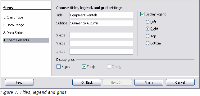
Adding or changing titles, legend, and grids
On the Chart Elements page (Figure 7), you can give your chart a title and, if desired, a subtitle. Use a title that draws the viewers’ attention to the purpose of the chart: what you want them to see. For example, a better title for this chart might be The Performance of Motor and Other Rental Boats.
It may be of benefit to have labels for the x axis or the y axis. This is where you give viewers an idea as to the proportion of your data. For example, if we put Thousands in the y axis label of our graph, it changes the scope of the chart entirely. For ease of estimating data you can also display the x or y axis grids by selecting the Display grids options.
You can leave out the legend or include it and place it to the left, right, top or bottom.
To confirm your selections and complete the chart, click Finish.
After you have created a chart, you may find things you would like to change. Calc provides tools for changing the chart type, chart elements, data ranges, fonts, colors, and many other options, through the Insert and Format menus, the right-click (context) menu, and the Chart toolbar.
You can change the chart type at any time. To do so:
First select the chart by double-clicking on it. The chart should now be surrounded by a gray border.
Then do one of the following:
Choose Format → Chart Type from the menu bar.
Click the chart type icon
![]() on the Formatting toolbar.
on the Formatting toolbar.
Right-click on the chart and choose Chart Type.
In each case, a dialog similar to the one in Figure 4 opens. See page 7 for more information.
Adding or removing chart elements
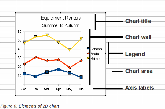
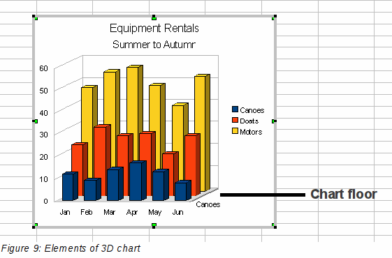
Figures 8 and 9 show the elements of 2D and 3D charts.
The default 2D chart includes only two of those elements:
Chart wall contains the graphic of the chart displaying the data.
Chart area is the area surrounding the chart graphic. The (optional) chart title and the legend (key) are in the chart area.
The default 3D chart also has the chart floor, which is not available in 2D charts.


You can add other elements using the commands on the Insert menu. The various choices open dialogs in which you can specify details.
First select the chart so the green sizing handles are visible. This is done with a single click on the chart.
The dialogs for Titles, Legend, Axes, and Grids are self-explanatory. The others are a bit more complicated, so we’ll take a look at them here.
Data labels put information about each data point on the chart. They can be very useful for presenting detailed information, but you need to be careful to not create a chart that is too cluttered to read.
Choose Insert → Data Labels. The options are as follows.
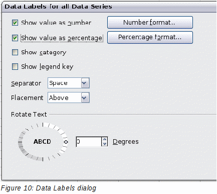
Show value as number
Displays the numeric values of the data points. When selected, this option activates the Number format... button.
Number format...
Opens the Number Format dialog, where you can select the number format. This dialog is very similar to the one for formatting numbers in cells, described in Chapter 2, Entering, Editing, and Formatting Data.
Show value as percentage
Displays the percentage value of the data points in each column. When selected, this option activates the Percentage format... button.
Percentage format...
Opens the Number Format dialog, where you can select the percentage format.
Show category
Shows the data point text labels.
Show legend key
Displays the legend icons next to each data point label.
Separator
Selects the separator between multiple text strings for the same object.
Placement
Selects the placement of data labels relative to the objects.
Figure 22 on page 24 shows examples of values as text (neither Show value as number nor Show value as percentage selected) and values as percentages, as well as when data values are used as substitutes for legends or in conjunction with them.
When you have a scattered grouping of points in a graph, you may want to show the relationship of the points. A trend line is what you need. Calc has a good selection of regression types you can use for trend lines: linear, logarithm, exponential, and power. Choose the type that comes closest to passing through all of the points.
To insert trend lines for all data series, double-click the chart to enter edit mode. Choose Insert → Trend Lines, then select the type of trend line from None, Linear, Logarithmic, Exponential, or Power. You can also choose whether to show the equation for the trend line and the coefficient of determination (R2).
To insert a trend line for a single data series, first select the data series in the chart, and then right-click and choose Insert → Trend Line from the context menu. The dialog for a single trend line is similar to the one below but has a second tab (Line), where you can choose attributes (style, color, width, and transparency) of the line.
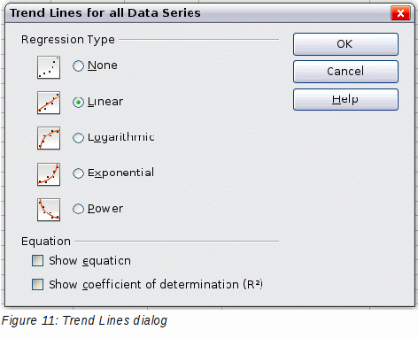
To delete a single trend line or mean value line, click the line, then press the Del key.
To delete all trend lines, choose Insert → Trend Lines, then select None.
A trend line is shown in the legend automatically.
If you insert a trend line on a chart type that uses categories, such as Line or Column, then the numbers 1, 2, 3, … are used as x-values to calculate the trend line.
The trend line has the same color as the corresponding data series. To change the line properties, select the trend line and choose Format Trend Line. This opens the Line tab of the Trend Lines dialog.
To show the trend line equation, select the trend line in the chart, right-click to open the context menu, and choose Insert Trend Line Equation.
When the chart is in edit mode, OpenOffice.org gives you the equation of the trend line and the correlation coefficient. Click on the trend line to see the information in the status bar. To show the equation and the correlation coefficient, select the line and choose Insert R2 and Trend Line Equation.
For more details on the regression equations, see the topic Trend lines in charts in the Help.
If you select mean value lines, Calc calculates the average of each selected data series and places a colored line at the correct level in the chart.
If you are presenting data that has a known possibility of error, such as social surveys using a particular sampling method, or you want to show the measuring accuracy of the tool you used, you may wish to show error bars on the chart. Select the chart and choose Insert → Y Error Bars.
Several options are provided on the Error Bars dialog. You can only choose one option at a time. You can also choose whether the error indicator shows both positive and negative errors, or only positive or only negative.
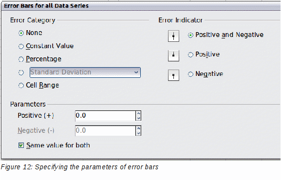
Constant value – you can have separate positive and negative values.
Percentage – choose the error as a percentage of the data points.
In the drop-down list:
Standard error
Variance – shows error calculated on the size of the biggest and smallest data points
Standard deviation – shows error calculated on standard deviation
Error margin – you designate the error
Cell range – calculates the error based on cell ranges you select. The Parameters section at the bottom of the dialog changes to allow selection of the cell ranges.
The Format menu has many options for formatting and fine-tuning the appearance of your charts.
Double-click the chart so that it is enclosed by a gray border indicating edit mode; then, select the chart element that you want to format. Choose Format from the menu bar, or right-click to display a context menu relevant to the selected element. The formatting choices are as follows.
Format Selection
Opens a dialog in which you can specify the area fill, borders, transparency, characters, font effects, and other attributes of the selected element of the chart (see page 19).
Position and Size
Opens a dialog (see page 22).
Arrangement
Provides two choices: Bring Forward and Send Backward, of which only one may be active for some items. Use these choices to arrange overlapping data series.
Title
Formats the titles of the chart and its axes.
Legend
Formats the location, borders, background, and type of the legend.
Axis
Formats the lines that create the chart as well as the font of the text that appears on both the X and Y axes.
Grid
Formats the lines that create a grid for the chart.
Chart Wall, Chart Floor, Chart Area
Described in the following sections.
Chart Type
Changes what kind of chart is displayed and whether it is two- or three-dimensional.
Data Ranges
Explained on page 7 (Figure 5 and Figure 6).
3D View
Formats 3D charts (see page 16).
|
Note |
Chart Floor and 3D View are only available for a 3D chart. These options are unavailable (grayed out) if a 2D chart is selected. |
In most cases you need to select the exact element you want to format. Sometimes this can be tricky to do with the mouse, if the chart has many elements, especially if some of them are small or overlapping. If you have Tooltips turned on (in Tools → Options → LibreOffice.org → General → Help, select Tips), then as you move the mouse over each element, its name appears in the Tooltip. Once you have selected one element, you can press Tab to move through the other elements until you find the one you want. The name of the selected element appears in the Status Bar.
You may wish to move or resize individual elements of a chart, independent of other chart elements. For example, you may wish to move the legend to a different place. Pie charts allow moving of individual wedges of the pie (in addition to the choice of “exploding” the entire pie).
Double-click the chart so that it is enclosed by a gray border.
Double-click any of the elements—the title, the legend, or the chart graphic. Click and drag to move the element. If the element is already selected, then move the pointer over the element to get the move icon (small hand), then click, drag and move the element.
Release the mouse button when the element is in the desired position.
|
Note |
If your graphic is 3D, round red handles appear which control the three-dimensional angle of the graphic. You cannot resize or reposition the graphic while the round red handles are showing. With the round red handles showing, Shift + Click to get the green resizing handles. You can now resize and reposition your 3D chart graphic. See the following tip. |
|
Tip |
You can resize the chart graphic using its green resizing handles (Shift + Click, then drag a corner handle to maintain the proportions). However, you cannot resize the title or the key. |
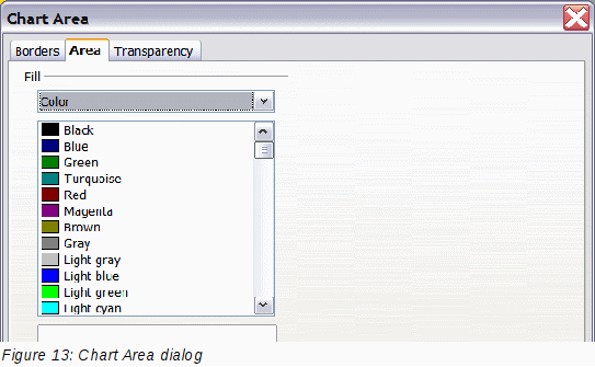
Changing the chart area background
The chart area is the area surrounding the chart graphic, including the (optional) main title and key.
Double-click the chart so that it is enclosed by a gray border.
Choose Format → Chart Area.
On the Chart Area dialog, choose the desired format settings.
On the Area tab, you can change the color, or choose a hatch pattern, bitmap or some preset gradients. Click on the drop-down box to see the options. Patterns are probably more useful than color if you have to print out your chart in black and white.
You can also use the Transparency tab to change the area’s transparency. If you used a preset gradient from the Area tab, you can see the different parameters of which it is composed.
Changing the chart graphic background
The chart wall is the area that contains the chart graphic.
Double-click the chart so that it is enclosed by a gray border.
Choose Format → Chart Wall. The Chart Wall dialog has the same formatting options as described in “Changing the chart area background” above.
Choose your settings and click OK.
If you need a different color scheme from the default for the charts in all your documents, go to Tools → Options → Charts → Default Colors, which has a much wider range of colors to choose from. Changes made in this dialog affect the default chart colors for any chart you make in future.
Use Format → 3D View to fine tune 3D charts. The 3D View dialog has three pages, where you can change the perspective of the chart, whether the chart uses the simple or realistic schemes, or your own custom scheme, and the illumination which controls where the shadows will fall.
To rotate a 3D chart or view it in perspective, enter the required values on the Perspective page of the 3D View dialog. You can also rotate 3D charts interactively; see page 19.
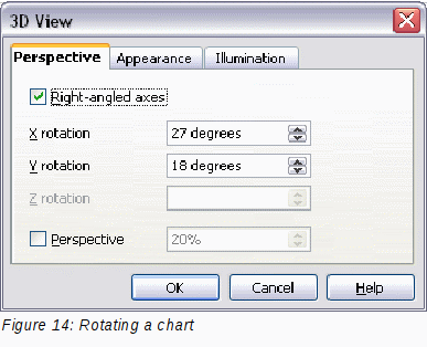
Some hints for using the Perspective page:
Set all angles to 0 for a front view of the chart. Pie charts and donut charts are shown as circles.
With Right-angled axes enabled, you can rotate the chart contents only in the X and Y direction; that is, parallel to the chart borders.
An x value of 90, with y and z set to 0, provides a view from the top of the chart. With x set to –90, the view is from the bottom of the chart.
The rotations are applied in the following order: x first, then y, and z last.
When shading is enabled and you rotate a chart, the lights are rotated as if they are fixed to the chart.
The rotation axes always relate to the page, not to the chart’s axes. This is different from some other chart programs.
Select the Perspective option to view the chart in central perspective as through a camera lens instead of using a parallel projection.
Set the focus length with the spin button or type a number in the box. 100% gives a perspective view where a far edge in the chart looks approximately half as big as a near edge.
Use the Appearance page to modify some aspects of a 3D chart’s appearance.
Select a scheme from the list box. When you select a scheme, the options and the light sources are set accordingly. If you select or deselect a combination of options that is not given by the Realistic or Simple schemes, you create a Custom scheme.
Select Shading to use the Gouraud method for rendering the surface. Otherwise, a flat method is used. The flat method sets a single color and brightness for each polygon. The edges are visible, soft gradients and spot lights are not possible. The Gouraud method applies gradients for a smoother, more realistic look. Refer to the Draw Guide for more details on shading.
Select Object Borders to draw lines along the edges.
Select Rounded Edges to smooth the edges of box shapes. In some cases this option is not available.
Use the Illumination page (Figure 16) to set the light sources for the 3D view. Refer to the Draw Guide for more details on setting the illumination.
Click any of the eight buttons to switch a directed light source on or off. By default, the second light source is switched on. It is the first of seven normal, uniform light sources. The first light source projects a specular light with highlights.
For the selected light source, you can then choose a color and intensity in the list just below the eight buttons. The brightness values of all lights are added, so use dark colors when you enable multiple lights.
Each light source always points at the middle of the object initially. To change the position of the light source, use the small preview inside this page. It has two sliders to set the vertical and horizontal position of the selected light source.
The button in the corner of the small preview switches the internal illumination model between a sphere and a cube.
Use the Ambient light list to define the ambient light which shines with a uniform intensity from all directions.
Rotating 3D charts interactively
In addition to using the Perspective page of the 3D View dialog to rotate 3D charts, you can also rotate them interactively.
Select the Chart Wall, then hover the mouse pointer over a corner handle or the rotation symbol found somewhere on the chart. The cursor changes to a rotation icon.
Press and hold the left mouse button and drag the corner in the direction you wish. A dashed outline of the chart is visible while you drag, to help you see how the result will look.
Depending on the purpose of your document, for example a screen presentation or a printed document for a black and white publication, you might wish to use more detailed control over the different chart elements to give you what you need.
To format an element, left-click on the element that you wish to change, for example one of the axes. The element will be highlighted with green squares. Then, right-click and choose an item from the context menu. Each chart element has its own selection of items. In the next few sections we explore some of the options.
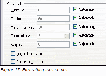
Formatting axes and inserting grids
Sometimes you need to have a special scale for one of the axes of your chart, or you need smaller grid intervals, or you want to change the formatting of the labels on the axis. After highlighting the axis you wish to change, right-click and choose one of the items from the context menu.
Choosing Format → Axis → X Axis or Format → Axis → Y Axis opens the dialog shown in Figure 17. The fields available on this dialog depend on the type of chart and whether it is 2D or 3D.
On the Scale tab, you can choose a logarithmic or linear scale (default), how many marks you need on the line, where the marks are to appear, and the increments (intervals) of the scale. You must first deselect the Automatic option in order to modify the value for any scale.
On the Label tab (Figure 18), you can choose whether to show or hide the labels and how to handle them when they won’t all fit neatly into one row (for example, if the words are too long).
Not shown here are the tab with options for choosing a font, formatting the lines, and positioning the elements of the line and interval marks.
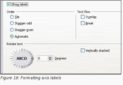
You can choose properties for the labels of the data series. Carefully click on the chart element, then right-click and choose the property you want to change. This opens a dialog with several tabs where you can change the color of the label text, the size of the font, and other attributes. The Label tab is shown in Figure 18.
On the Data Labels tab, you can choose whether to:
Show the labels as text
Show numeric values as a percentage or a number
Include the legend box as part of the label
These choices are the same as those shown in Figure 10 on page 11.
The text for labels is taken from the column labels and it cannot be changed here. If the text needs to be abbreviated, or if it did not label your graph as you were expecting, you need to change it in the original data table.
Multiple columns of categories are displayed in a hierarchical manner at the axis as shown. To get that automatically while creating a chart, make sure that all the first columns (or rows) contain text and not only numbers. You can also choose to set the ranges for categories to multiple columns on the Data Series page in the Wizard or the Data Ranges dialog.
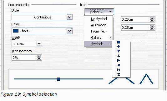
Choosing and formatting symbols
In line and scatter charts the symbols representing the points can be changed to a different symbol shape or color through the object properties dialog. Select the data series you wish to change, right-click, and choose Format → Data Series from the context menu.
On the Line tab of the Data Series dialog, in the Icon section, choose from the drop-down list Select → Symbols. Here you can choose no symbol, a symbol from an inbuilt selection, a more exciting range from the gallery, or if you have pictures you need to use instead, you can insert them using Select → From file.
Adding drawing objects to charts
As in the other LibreOffice components, you can use the drawing toolbar to add simple shapes such as lines, rectangles, and text objects, or more complex shapes such as symbols or block arrows. Use these additional shapes to add explanatory notes to your chart, for example.
To format the drawing objects, right-click and choose from the context menu.
You can resize or move all elements of a chart at the same time, in two ways: interactively, or by using the Position and Size dialog. You may wish to use a combination of both methods: interactive for quick and easy change, then the dialog for precise sizing and positioning.
To resize a chart interactively:
Click once on the chart to select it. Green sizing handles appear around the chart.
To increase or decrease the size of the chart, click and drag one of the markers in one of the four corners of the chart. To maintain the correct ratio of the sides, hold the Shift key down while you click and drag.
To move a chart interactively:
Click on the chart to select it. Green sizing handles appear around the chart.
Hover the mouse pointer anywhere over the chart. When it changes to the move icon, click and drag the chart to its new location.
Release the mouse button when the element is in the desired position.
Using the Position and Size dialog
To resize or move a chart using the Position and Size dialog:
Click on the chart to select it. Green sizing handles appear around the chart.
Right-click and choose Position and Size from the context menu.
Make your choices on this dialog.
Position is defined as an X,Y coordinate relative to a fixed point (the base point), typically located at the upper left of the document. You can temporarily change this base point to make positioning or dimensioning simpler (click on the spot corresponding to the location of the base point in either of the two selection windows on the right side of the dialog—upper for positioning or lower for dimensioning).
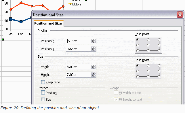
The possible base point positions correspond to the handles on the selection frame plus a central point. The change in position lasts only as long as you have the dialog open; when you close this dialog, Calc resets the base point to the standard position.
|
Tip |
The Keep ratio option is very useful. Select it to keep the ratio of width to height fixed while you change the size of an object. |
Either or both the size and position can be protected so that they cannot be accidentally changed. Select the appropriate options.
|
Tip |
If you cannot move an object, check to see if its position is protected. |
Its important to remember that while your data can be presented with a number of different charts, the message you want to convey to your audience dictates the chart you ultimately use. The following sections present examples of the types of charts that Calc provides, with some of the tweaks that each sort can have and some notes as to what purpose you might have for that chart type. For details, see the Help.
Column charts are commonly used for data that shows trends over time. They are best for charts that have a relatively small number of data points. (For large time series a line chart would be better.) It is the default chart type, as it is one of the most useful charts and the easiest to understand.
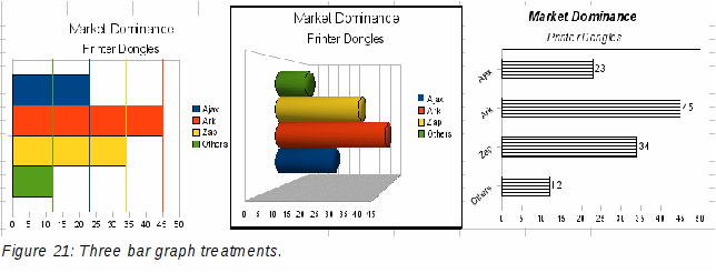
Bar charts are excellent for giving an immediate visual impact for data comparison in cases when time is not an important factor, for example, when comparing the popularity of a few products in a marketplace.
The first chart is achieved quite simply by using the chart wizard with Insert → Grids, deselecting y-axis, and using Insert → Mean Value Lines.
The second chart is the 3D option in the chart wizard with a simple border and the 3D chart area twisted around.
The third chart is an attempt to get rid of the legend and put labels showing the names of the companies on the axis instead. We also changed the colors to a hatch pattern.
Pie charts are excellent when you need to compare proportions. For example, comparisons of departmental spending: what the department spent on different items or what different departments spent. They work best with smaller numbers of values, about half a dozen; more than this and the visual impact begins to fade.
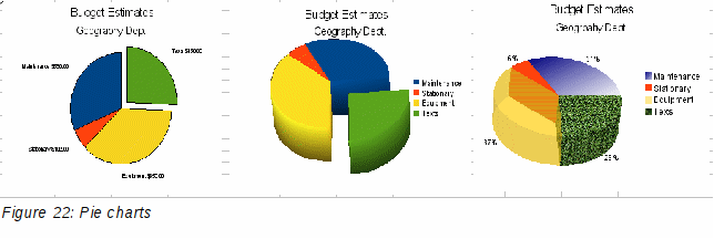
As the Chart Wizard guesses the series that you wish to include in your pie chart, you might need to adjust this initially on the Wizard’s Data Ranges page if you know you want a pie chart, or by using the Format → Data Ranges → Data Series dialog.
You can do some interesting things with a pie chart, especially if you make it into a 3D chart. It can then be tilted, given shadows, and generally turned into a work of art. Just don’t clutter it so much that your message is lost, and be careful that tilting does not distort the relative size of the segments.
You can choose in the Chart Wizard to explode the pie chart, but this is an all or nothing option. If your aim is to accentuate one piece of the pie, you can separate out one piece by carefully highlighting it after you have finished with the Chart Wizard, and dragging it out of the group. When you do this you might need to enlarge the chart area again to regain the original size of the pieces.
The effects achieved in Figure 22 are explained below.
2D pie chart with one part of the pie exploded: Choose Insert → Legend and deselect the Display legend box. Choose Insert → Data Labels and choose Show value as number. Then carefully select the piece you wish to highlight, move the cursor to the edge of the piece and click (the piece will have nine green highlight squares to mark it), and then drag it out from the rest of the pieces. The pieces will decrease in size, so you need to highlight the chart wall and drag it at a corner to increase the size.
3D pie chart with realistic schema and illumination: Choose Format → 3D view → Illumination where you can change the direction of the light, the color of the ambient light, and the depth of the shade. We also adjusted the 3D angle of the disc in the Perspective dialog on the same set of tabs.
The chart updates as you make changes, so you can immediately see the effects.
If you want to separate out one of the pieces, click on it carefully; you should see a wire frame highlight. Drag it out with the mouse and then, if necessary, increase the size of the chart wall.
3D pie chart with different fill effects in each portion of the pie: Choose Insert → Data labels and select show value as percentage. Then carefully select each of the pieces so that it has a wire frame highlight and right-click to get the object properties dialog; choose the Area tab. For one we chose a bitmap, for another a gradient and for the third we used the Transparency tab and adjusted the transparency to 50%.
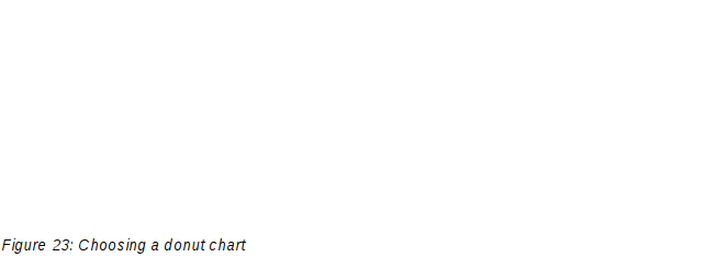
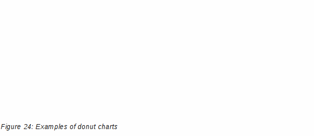
Donut charts are a variation on the pie chart. To create one, choose Pie in the Chart Type dialog, and choose the third or fourth type of pie chart. For more variety, choose 3D Look.
An area chart is a version of a line or column graph. It may be useful where you wish to emphasize volume of change. Area charts have a greater visual impact than a line chart, but the data you use will make a difference.
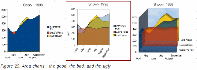
As shown in Figure 25, an area chart is sometimes tricky to use. This may be one good reason to use transparency values in an area chart. After setting up the basic chart using the Chart Wizard, do this:
Right-click on the Y axis and choose Delete Major Grid. As the data overlaps, some of it is missing behind the first data series. This is not what you want. A better solution is shown in Chart 2.
After deselecting the Y axis grid, right-click on each data series in turn and choose Format Data Series. On the Transparency tab, set Transparency to 50%. The transparency makes it easy to see the data hidden behind the first data series. Now, right-click on the X axis and choose Format Axis. On the Label tab, choose Tile in the Order section and set the Text orientation to 55 degrees. This places the long labels at an angle.
To create the third variation, after doing the steps above, right-click and choose Chart Type. Choose the 3D Look option and select Realistic from the drop-down list. We also twisted the chart area around and gave the chart wall a picture of the sky. As you can see, the legend turns into labels on the z-axis. But overall, though it is visually more appealing, it is more difficult to see the point you are trying to make with the data.
Other ways of visualizing the same data series are represented by the stacked area chart or the percentage stacked area chart.
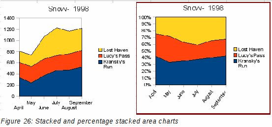
The first does what it says: each number of each series is added to the others so that it shows an overall volume but not a comparison of the data. The percentage stacked chart shows each value in the series as a part of the whole. For example in June all three values are added together and that number represents 100%. The individual values are a percentage of that. Many charts have varieties which have this option.
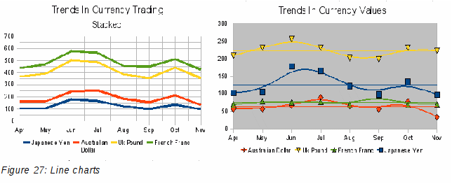
A line chart is a time series with a progression. It is ideal for raw data, and useful for charts with plentiful data that show trends or changes over time where you want to emphasize continuity. On line charts, the x-axis is ideal to represent time series data.
Things to do with lines: thicken them, make them 3D, smooth the contours, just use points.
3D lines confuse the viewer, so just using a thicker line often works better.
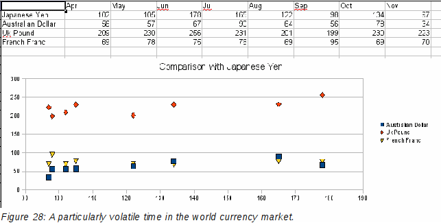
Scatter charts are great for visualizing data that you have not had time to analyze, and they may be the best for data when you have a constant value against which to compare the data; for example, weather data, reactions under different acidity levels, conditions at altitude, or any data which matches two series of numeric data. In contrast to line charts, the x-axis are the left to right labels, which usually indicate a time series.
Scatter charts may surprise those unfamiliar with how they work. While constructing the chart, if you choose Data Range → Data series in rows, the first row of data represents the x-axis. The rest of the rows of data are then compared against the first row data. Figure 28 shows a comparison of three currencies with the Japanese Yen. Even though the table presents the monthly series, the chart does not. In fact the Japanese Yen does not appear; it is merely used as the constant series that all the other data series are compared against.
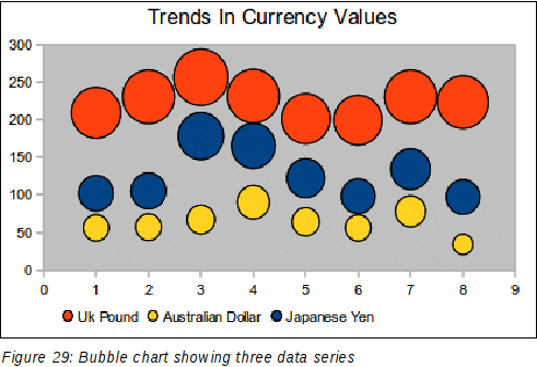
A bubble chart is a variation of a scatter chart in which the data points are replaced with bubbles. It shows the relations of three variables in two dimensions. Two variables are used for the position on the X-axis and Y-axis, while the third is shown as the relative size of each bubble. One or more data series can be included in a single chart.
Bubble charts are often used to present financial data. The data series dialog for a bubble chart has an entry to define the data range for the bubbles and their sizes.
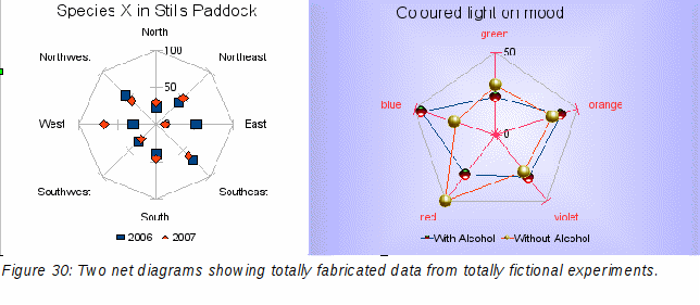
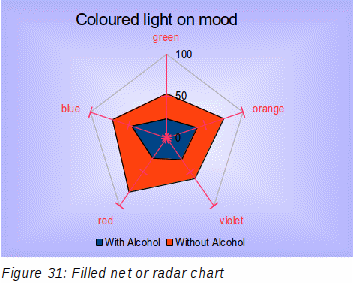
A net chart is similar to a polar or radar chart. They are useful for comparing data that are not time series, but show different circumstances, such as variables in a scientific experiment or direction. The poles of the net chart are equivalent to the y-axes of other charts. Generally, between three and eight axes are best; any more and this type of chart becomes confusing. Before and after values can be plotted on the same chart, or perhaps expected and real results, so that differences can be compared.
Figure 30 shows two types of net charts:
(Left): Plain net chart without grids and with just points, no lines.
(Right): Net chart with lines, points and grid. Axes colors and labels changed. Chart area color = gradient. Points changed to fancy 3D ones.
Other varieties of net chart show the data series as stacked numbers or stacked percentages. The series can also be filled with a color (Figure 31). Partial transparency is often best for showing all the series.
A stock chart is a specialized column graph specifically for stocks and shares. You can choose traditional lines, candlestick, and two-column type charts. The data required for these charts is quite specialized, with series for opening price, closing price, and high and low prices. Of course the x-axis represents a time series.
When you set up a stock chart in the Chart Wizard, the Data Series dialog is very important. You need to tell it which series is for the opening price, closing price, high and low price of the stock and so on. Otherwise the chart may be indecipherable. The sample table for this chapter needed to be changed to fit the data series.
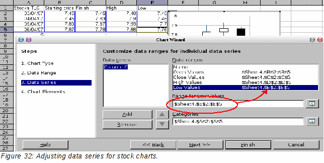
A nice touch is that OpenOffice.org Chart color-codes the rising and falling shares: white for rising and black for falling in the candlestick chart, and red and blue in the traditional line chart.
A column and line chart is a combination of two other chart types. It is useful for combining two distinct but related data series, for example sales over time (column) and the profit margin trends (line).
You can choose the number of columns and lines in the Chart Wizard. So for example you might have two columns with two lines to represent two product lines with the sales figures and profit margins of both.
The chart in Figure 33 has manufacturing cost and profit data for two products, over a period of time (six months in 2007). To create this chart, first highlight the table and start the Chart Wizard. Choose Column and Line chart type with two lines and the data series in rows. Then give it a title to highlight the aspect you want to show. The lines are different colors at this stage and don’t reflect the product relationships. When you finish with the Chart Wizard, highlight the chart, click on the line, right-click and chose Format Data Series.
On this tab there are a few things to change: The colors should match the products. So both Ark Manufacturing and profit are blue and Prall is red. The lines need to be more noticeable so make the lines thicker by increasing the width to 0.08.
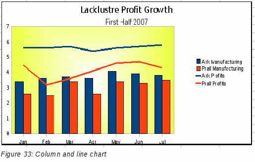
For the background, highlight the chart wall, right-click and choose Format Wall. On the Area tab, change the drop-down box to show Gradient. Choose one of the preset gradient patterns and make it lighter by going to the Transparency tab and making the gradient 50% transparent.
To make the chart look cleaner without the grid, go to Insert → Grids and deselect the X-axis option.